![Social media post. Text: "Best selling car in [Italy flag] vs [US flag]. With such a small car, i have no idea how Italians do their weekly Costo/Walmart grocery run" with upside-down face emoji. Below, a carsized.com side-view comparison showing a tiny Fiat Panda 3 (3.653m long, 1.551m tall) next to a massive Ford F-150 (5.89m long, 1.961m tall) - the pickup towers over and extends far beyond the Panda, which barely reaches its door handle](/_astro/sas-us-big-1-19.DoXTWO2I.webp)


This is what the 48 contiguous states of the USA would look like on Google Maps if they were just above the Equator in Africa
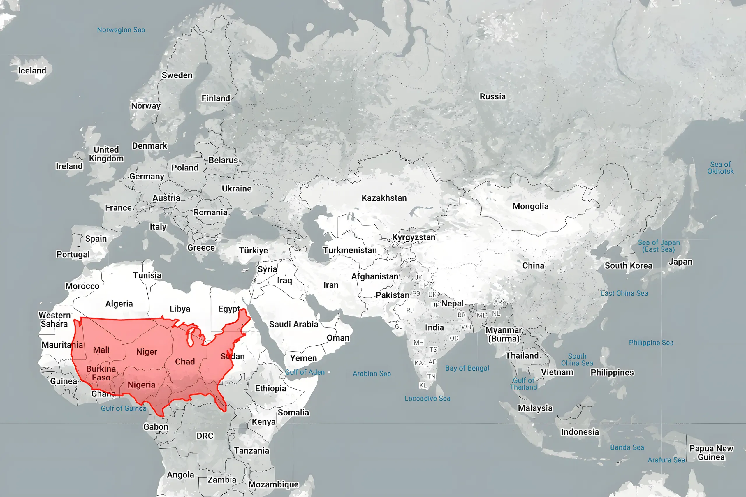
Important note: The Web Mercator projection that Google Maps uses makes everywhere look bigger than it really is the further from Equator you go. So if you’re comparing the USA to Europe, for example, the map above is misleading. If you instead place the 48 states directly over Europe, they look bigger and it gets more exaggerated the further north you put them.
However, it remains a fact that if the USA was just above the Equator in Africa instead of where it really is, this is how it would look on a Mercator map of the world.
You may not be surprised by this but some clearly would be - and it’s still a rarely seen and mildly interesting view.
Thanks to thetruesize.com.
Timestamped clip from a Vsauce video about map projections
From thetruesize.com again, here’s
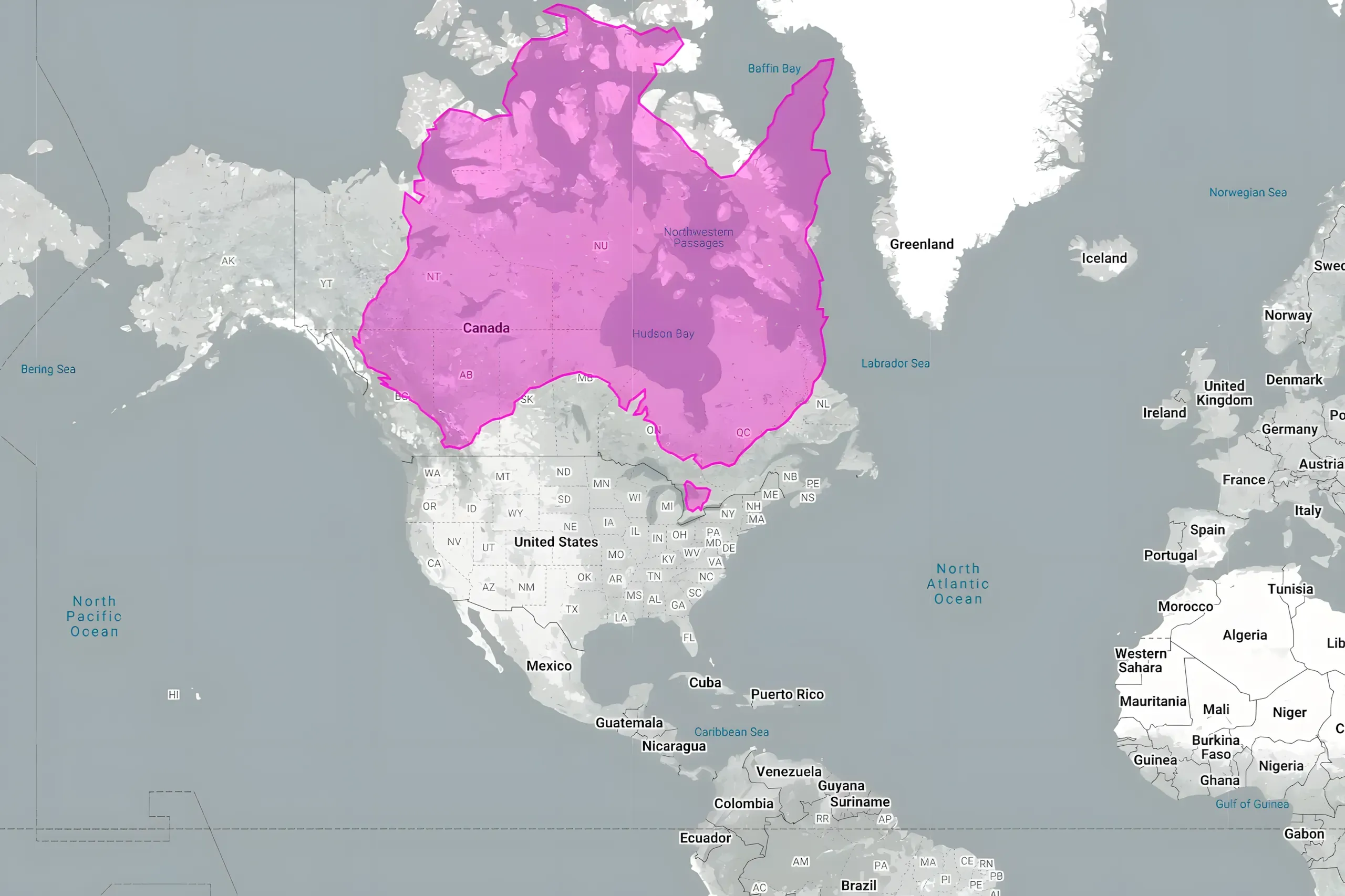
Australia if it were where Canada is
Texas moved just over the border
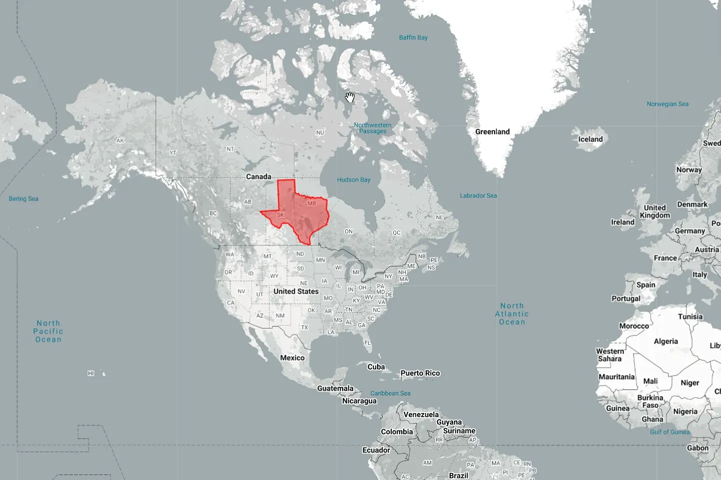
”Hot dang!”
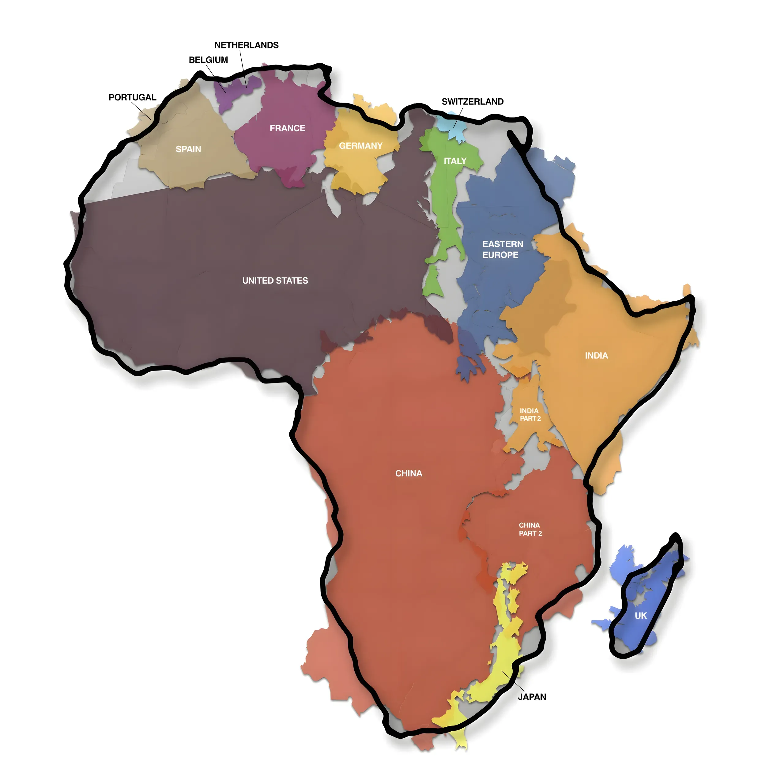
“The True Size of Africa”
And finally: the main map from Kai Krause’s infographic - “A small contribution in the fight against rampant immappancy” …
One more
Oh, and, as one person said
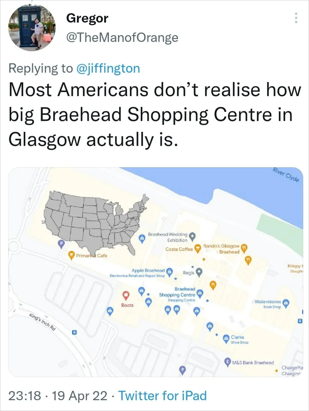
As a Glaswegian, even I was surprised by the scale of Braehead shopping centre